DeVITO DEFENSE - INITIAL LOGO CONCEPT
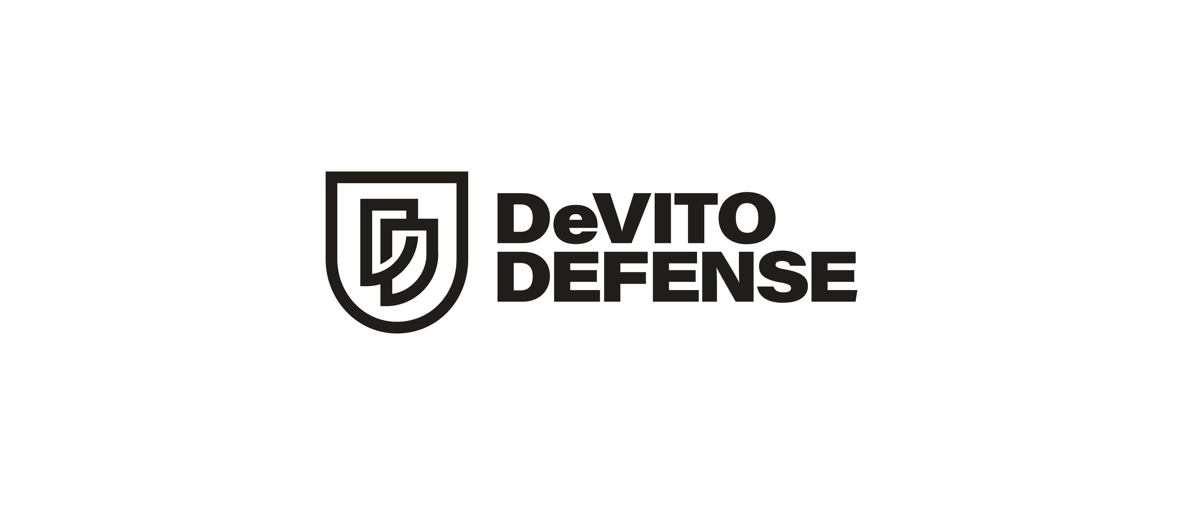
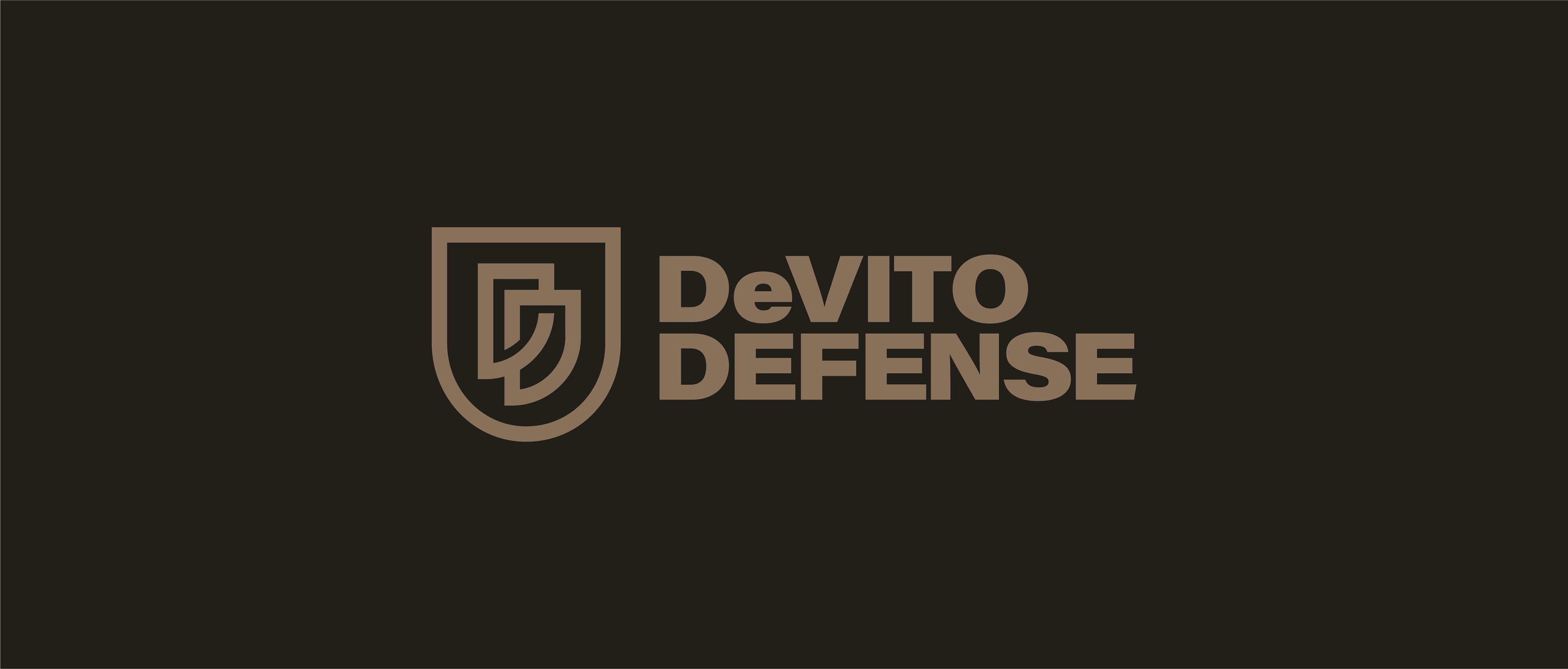
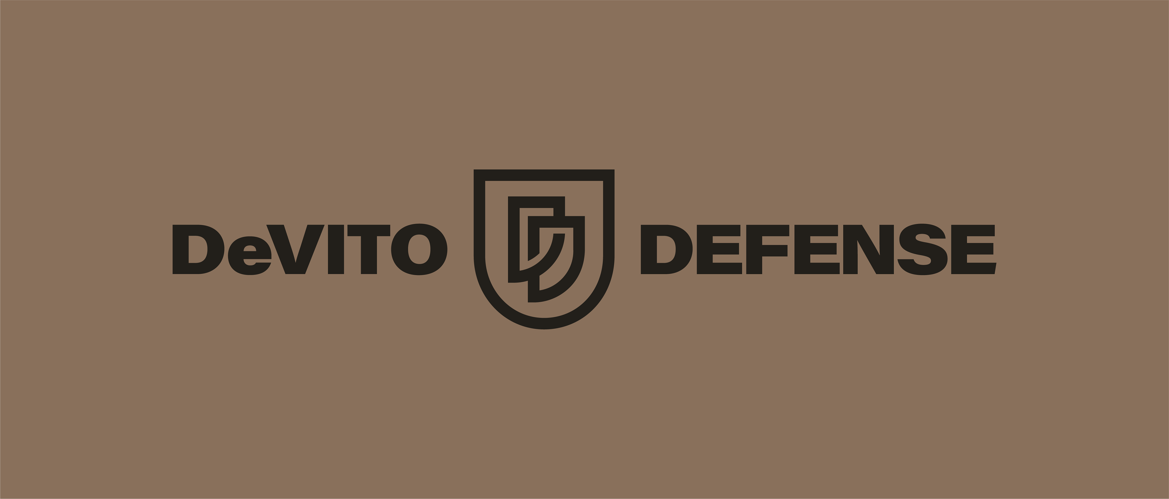
This logo is pretty straightforward and doesn't need a whole lot of explanation to get. It's a shield with the company initials stylized to look cool af. That's it. If you're in a time crunch you can skip the rest of this text because it's really just a cool shield with 2 D's.
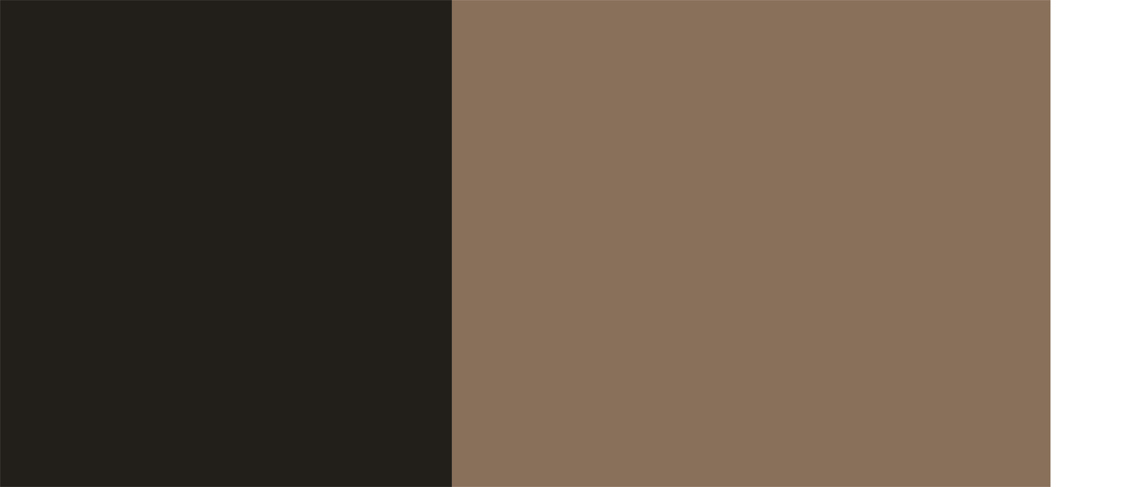
To give off that premium vibe, less is more. This logo wouldn't feel out of place being gold foil stamped onto a high end luxury watch box. While it positions itself as a higher end, clean brand, it firmly plants itself into the 2A space with its color and styling without crossing over into mall ninja territory.
If you look at this logo and think "This doesn't look like a gun store logo" then I think we're on the right track. Forget the airsoft quality junk, $99 Hi-Points, and pawnshop vibe. You're at DeVito Defense because you are a connoisseur - you want the best, you've already read and watched the reviews, and you're glad theres a shop that has a curated selection of accessories and firearms that just understands and gets it. This isn't the place where you're going to listen to bubba explain how things would have ended differently if he was in 'Nam, or tell you the only thing you need is a 12GA loaded with birdshot because just the sound of racking your shotgun is sure to scare 'em off.
Some more logo notes: The shield isn't pointy, but rounded and shaped like the letter D to really drive that D theme home. The D's are stylized in a way to try to bring the V from DeVito into the logo to keep things interesting.
I know you asked for 2 D's back to back, but it goes against everything I stand for to intentionally display a letter backwards for a premium brand. I hope this is a good compromise.
Let me know what you think and what changes you would like to see. If you hate it, don't hold back. Honest feedback is important so we can land on a logo you can use for years without feeling like you settled.
The Color Palette
The Shield

Full Logo
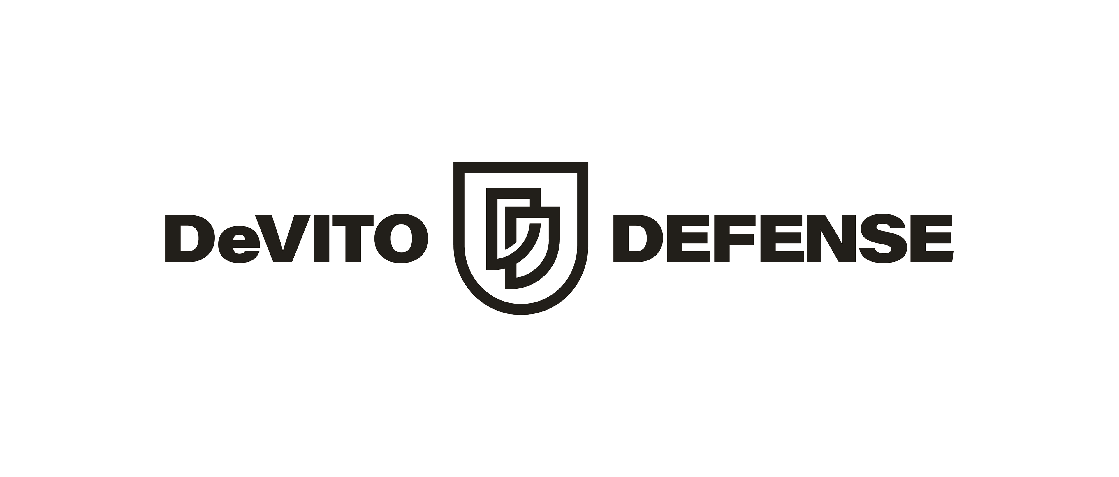
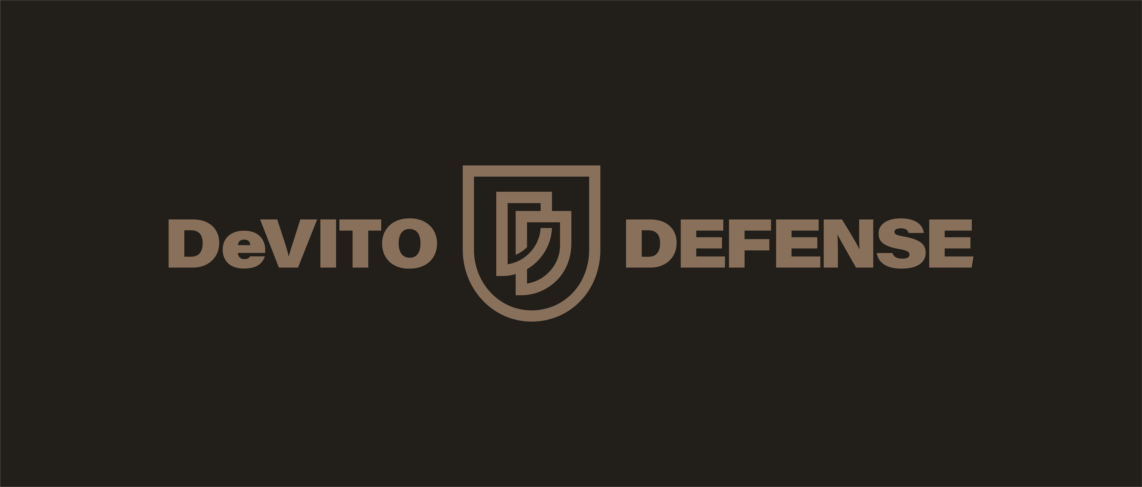
Alternate Layout

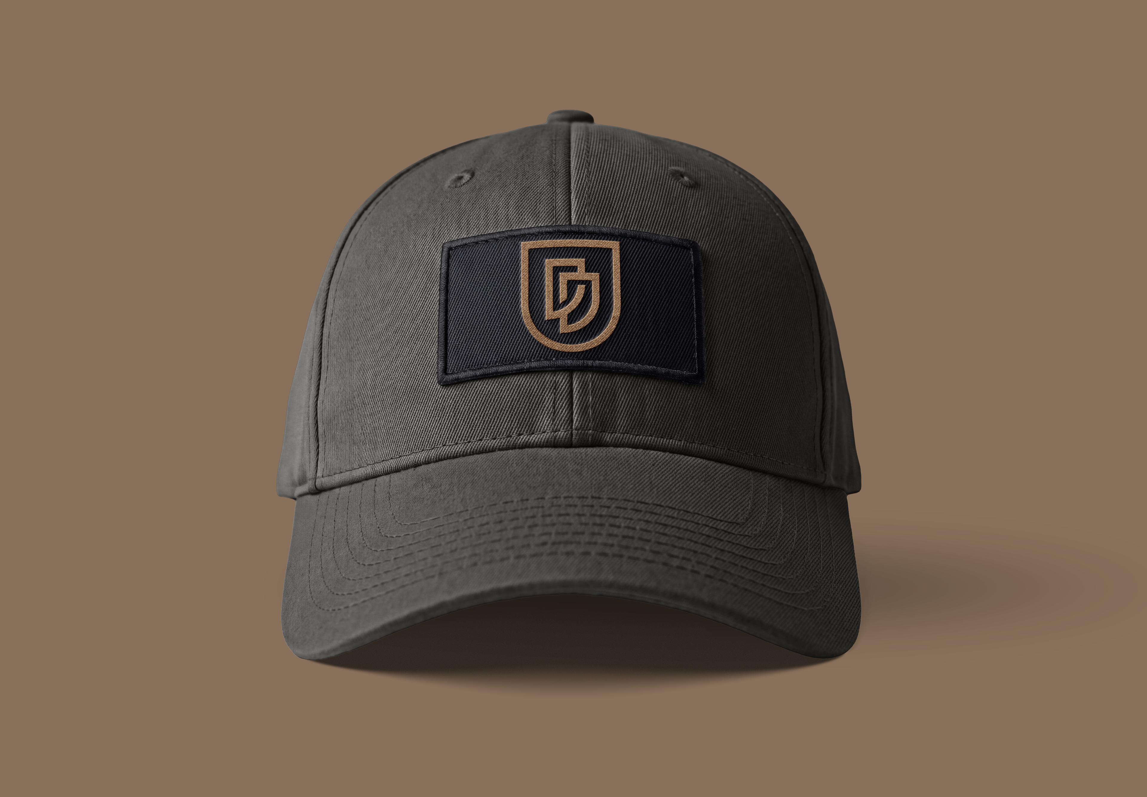
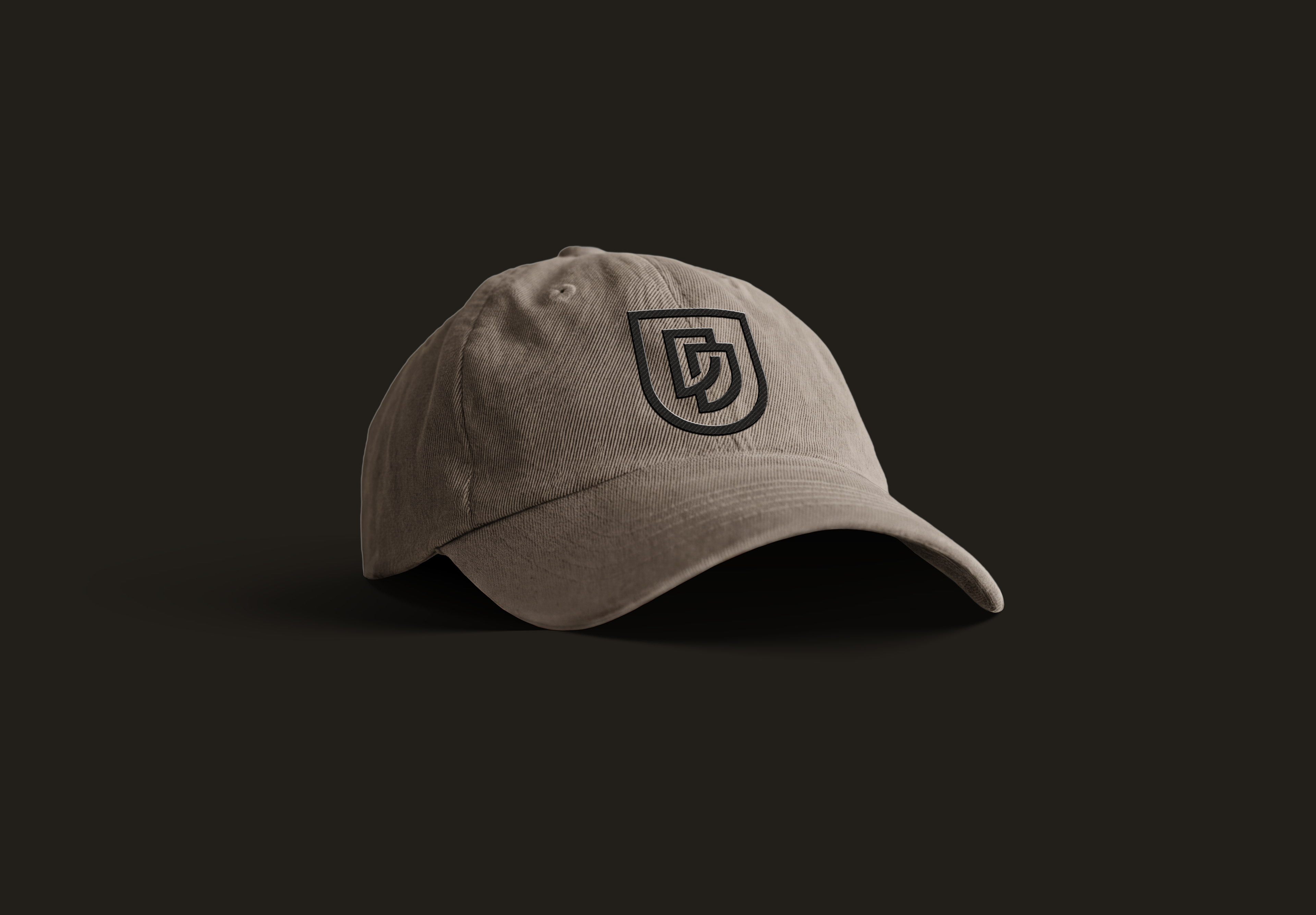
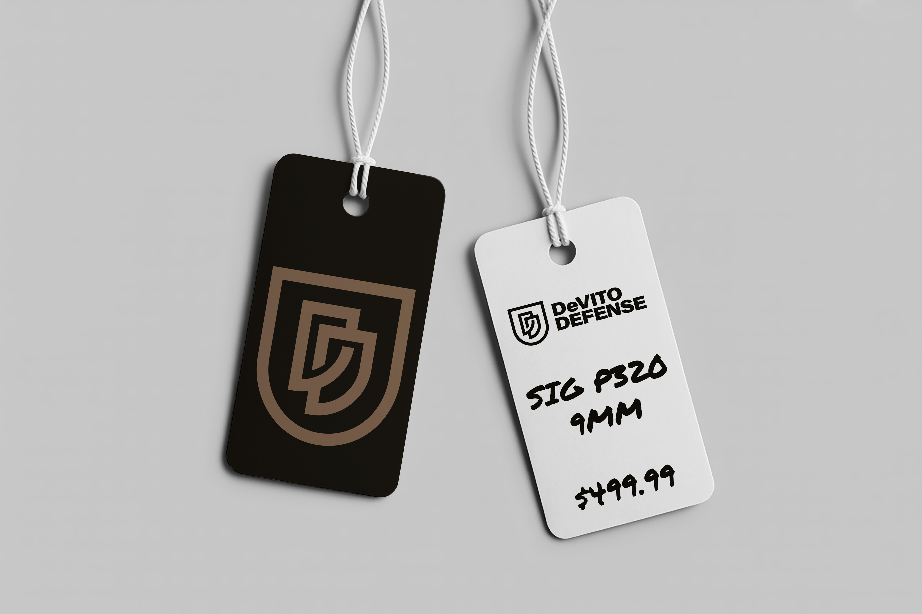
Styling Examples
Black and white variants