

Visual Foundation
Before I present the logo I want to go over some background on why this direction was taken. The following graphic offers a simplified understanding of what makes up the MDA logo.
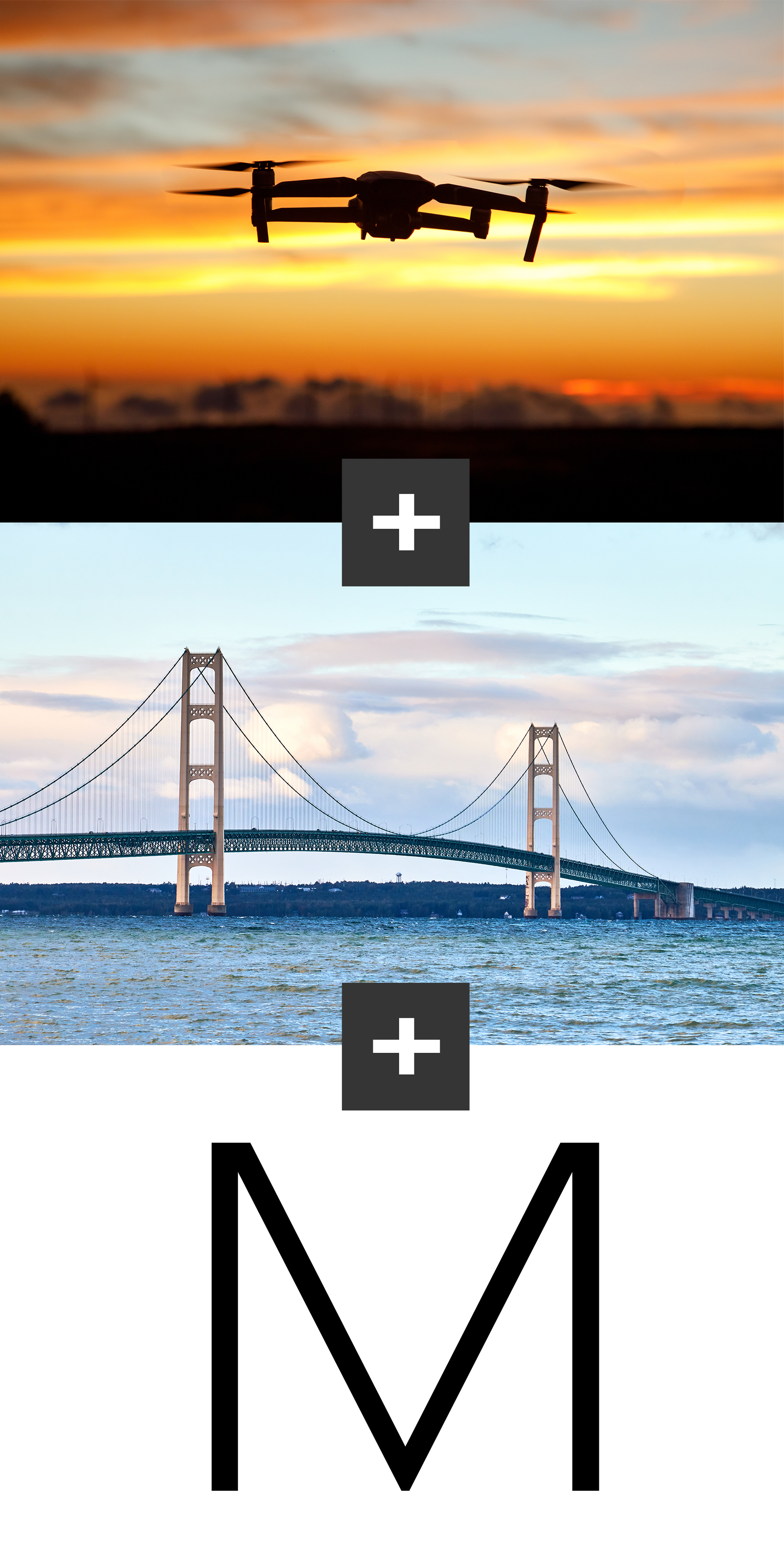
The MDA logo mark is a stylized combination of the above elements. No drone associated logo is complete without an abstract representation of a drone - so of course I had to drop one in right at the top hovering over the bridge. To bring a Michigan vibe to the logo, the Mackinac Bridge was brought in. This iconic symbol establishes a connection between MDA and the state. This element was also mentioned to be used on your challenge coin. Utilizing this element again establishes consistency and familiarity in your brand. The bridge also forms an abstract M (for Michigan) to round out the last element.
It isn't all just about looks - there's actually a deeper meaning to the use of the bridge in the logo. Just like the Mackinac connects the entire state of Michigan together, MDA connects Michigan drone operators to resources in the UAV space establishing unity within the industry. No longer do pilots need to aimlessly navigate the treacherous waters looking for training, collaborative partners, or research - the Michigan Drone Association offers a clear and easily navigable path to these resources.
The Logo
The logo sheds its shield and consolidates its colors to make it easier to use in a wide range of applications. Even though the shield is a state symbol, it felt too police badge like for general commercial or utility use. The original MIPSDA logo was intended for public safety, but the vibe didn't translate well into other use cases. This is a bit of a departure from the original, but I think it offers a bold, refined look that is very brandable. It also offers the chance to get creative with copy and play off the bridge element (something along the lines of: MDA - bridging the gap between operators and UAV resources) (I'm sure an actual copywriter can come up with something better)
We can maintain some consistency by using the original typeface used in the MIPSDA logo. This offers a familiar feel to those who know the brand.


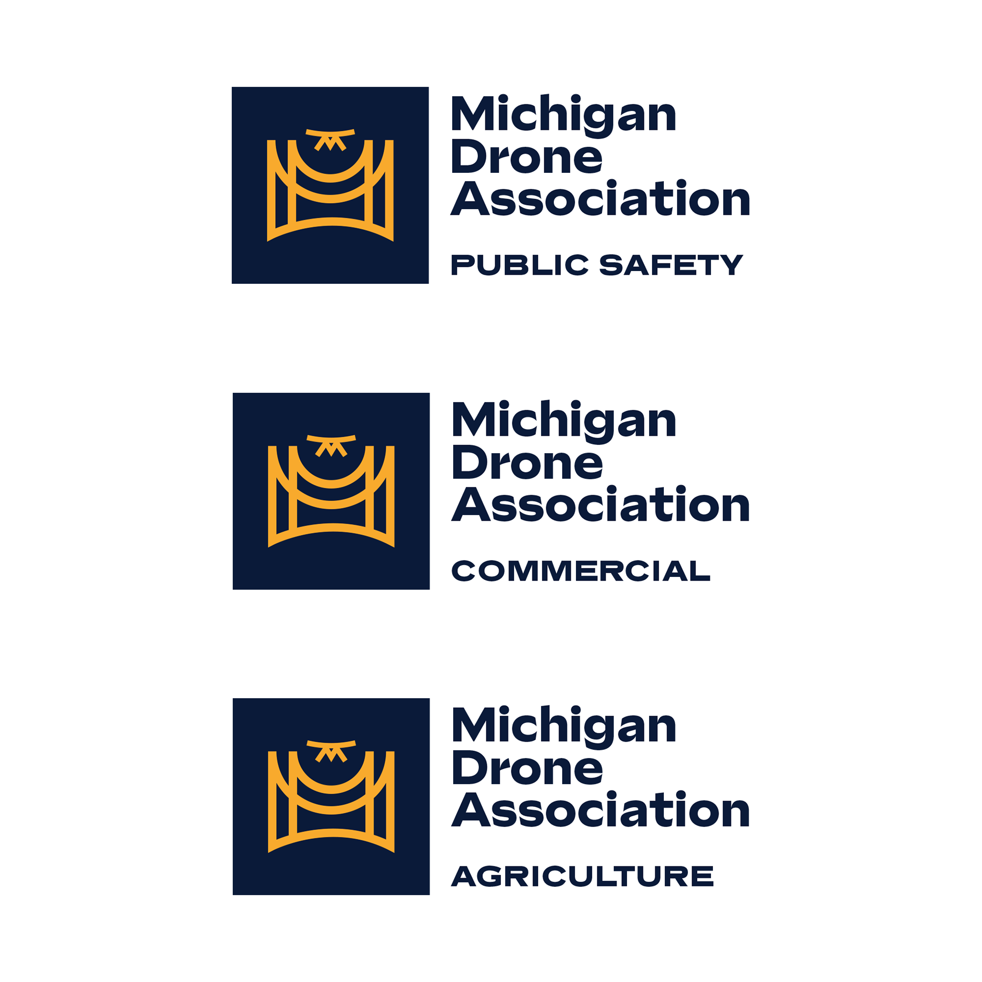
Division Labels
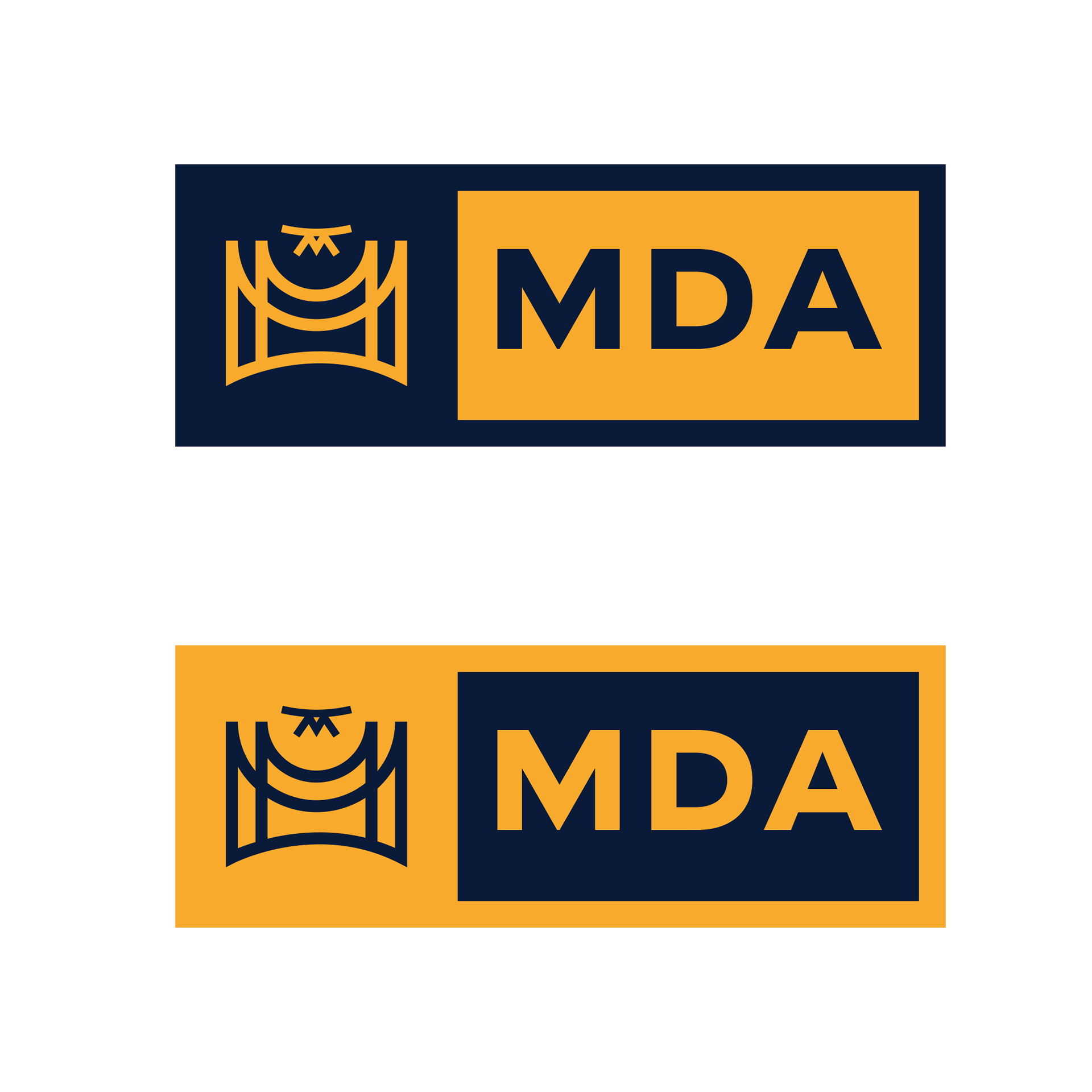
Alternate versions
Black and white

Let me know your thoughts on this. I do understand this might be a bigger leap from the original than anticipated - and if you think it's too much we can walk it back a bit. Nothing is set in stone here yet, so please feel free to let me know if you would like to see any changes or even another concept.