Ryent Brand Colors
This palette heavily leans into the Made in America and first responder themes behind the brand. Multiple combinations of the colors below can be used to create a bold, high-impact appearance. The primary combination would be 75% dark blue and 25% red, but these can be mixed and matched as needed. Using red as the dominant color is great for applications where you need to draw attention to the brand fast. In instances where you have a lot of copy, white would be used as a background color with blue and red accents for headlines and supporting elements.
Let me know your thoughts on this. This is the color combination that made the most sense to me, but if you'd rather get away from the red, white, and blue I can adjust as needed.


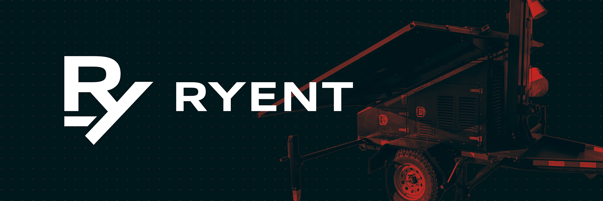
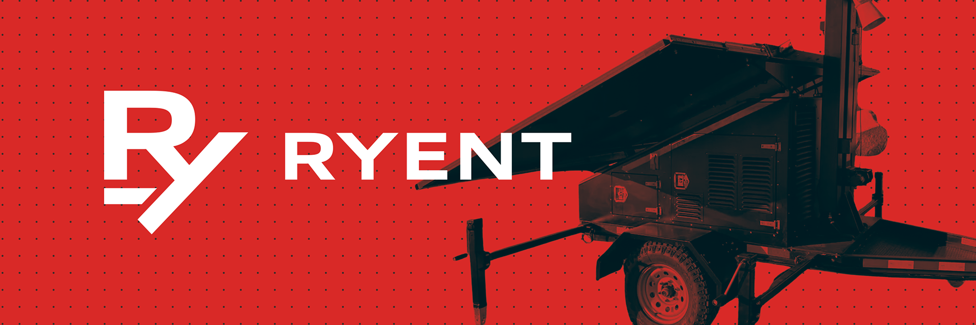
Examples of colors in use with photography